Production Art & Design
Broadhead
Broadhead, a marketing agency based in Minneapolis, MN, is a constant swirl of digital, print and packaging collateral. Bh’s client profile is primarily agricultural but its portfolio is ever-expanding under the maxim: Eat, Move + Live. Volume is intense. I learned how to triage, cope and to keep moving in a steady manner as a Production Artist, but also how to execute with proficiency, grace and even style. This is just some of the work, but a good example of the production projects that I have devoted a lot of time and energy to in the past 3+ years.
Branding
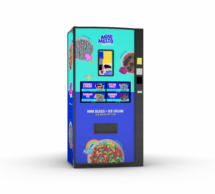
Broadhead rebranded East Coast-based Mini Melts in late 2024. Besides the prodigous prepress work for the rebrand itself, it was also simultaneously applied to three different types of freezers, three types of vending machines and 72” food cart. This meant that each graphic element set the precedent for all other ensuing graphic elements, and the others yet to be. Colors needed consistency out of the gate, backgrounds had to wrap around freezers and vending machines and align perfectly, and everything had to fit within each machine’s template, each with their own precise dimensional specifications. There were so many elements to corral and keep consistent, and also because of its many applications, it became an immense though joyful task!
Cart with a sneeze guard, Mini Melt flavor options and a full 360° wrapped display and base.
Two of the three types of vending machines that we “wrapped” with the new designs.


The freezer’s colorful backdrop, which had to be reversed when keylined for it’s double-sided display.
A freezer lid, with new flavor display
and their corresponding color branding.


There are 6 primary brand colors and 16 secondary colors at use throughout the Mini Melts rebrand. There were many different parts for every machine wrapped and each part had it’s own mix of graphic elements. I successfully shifted all different types of elements into brand colors, and incorporated all elements to fit into each specific template and dieline. Because the colors shifted throughout the lengthy design process, it added to the complexity of the work.


Packaging/
Media Kits
As part of a 2023 promotional campaign Broadhead designed an elaborate media kit for Boerhinger Ingelheim’s Aservo EquiHaler, a product which disperses an inhaled anti-inflammatory treatment for equine asthma. The kit included a soft touch base, a spot gloss layer and even a little texture. It was such a knockout visual and tactile experience that the box itself became a promotional product.
1st layer: Soft Touch base (blue)

2nd layer: Spot gloss (pink)

3rd layer: texture (yellow).
Each layer fit together like a beautiful jigsaw puzzle within the print-ready packaged file.


Packaging Interior
Estrotect Breeding Indicator Packaging
With one beginning creative prototype, I created four additional package exteriors and interiors, for a total of five new indicators, each with their own brand color. There was a fair amount of textural graphics that needed to be cleaned up and grouped together, both to reduce file size and for everything to fit together neatly.


Equine Product Tower 2024
Complex, multi-component unit made print-ready. Each component had to be laid out individually within its own diecut template and then fitted together. The bottom section is updated yearly, for a multi-use, a pleasant design refresh, and less money and waste.

Trade show booths
I keylined, proofed, edited, and upgraded image size and resolution, before I packaged up all print-ready files for Firestone’s enormous trade show booths for an agricutural trade show in Houston, TX,
in early 2024.
For one booth, I took a successful 8.5”x11” Firestone print ad that Broadhead had created in 2022 (left), and enlarged it into one of the larger fabric-backed walls of their display (12’x15’).
Some of our team went to visit the vendor, nParallel here in Minneapolis, to check out the work before it was sent out. The pics below show both the scale and some of the detailed planning it took to make
it all come together .


We were amazed when we saw all the materials rendered to full scale at the nParallel warehouse, and I was pleased to see that even at 150 dpi, the resolution of the booths were strikingly clear and the colors richly vibrant.
For its trade show in 2024, Lallemande Biofuels & Distilled Spirits (LBDS) featured futuristic booths designed to illustrate its cutting edge technology and to emphasize that their company is “the future of fermentation”. Besides the highly detailed structures, the booths included interactive animations that demonstrated the complex distillation processes which enable LBDS through its various technologies to increase profit for the consumer. My main job was make sure all the illustrative work fit within the complex templates and to ensure all of the many files were print-ready.


Design
Some general design work in my time at broadhead, some mere pitched designs,
––but all good times.
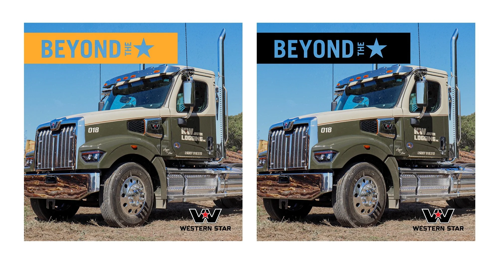
Western Star Social Post Templates


Bus “King” Ad and “Tail” ad for Portland, Oregon’s city transportation service, TriMet.


A ton of creative layout work happens frequently.


Brochures
I prepress a good amount of product lists and educational brochures for our clients. Besides brand color updates, editing, proofing, etc, the job often involved re-laying out new designs into updated template sizes, depending on the
print vendor involved, as well as updating the designs themselves.


Digital Banner ADS
Digital banner ads are a constant which means constant resizing for both static and animated ads. Here are some examples of the types of banners and some of the resizes, each presenting their own problems in terms of legibility and layout.


Printwerk
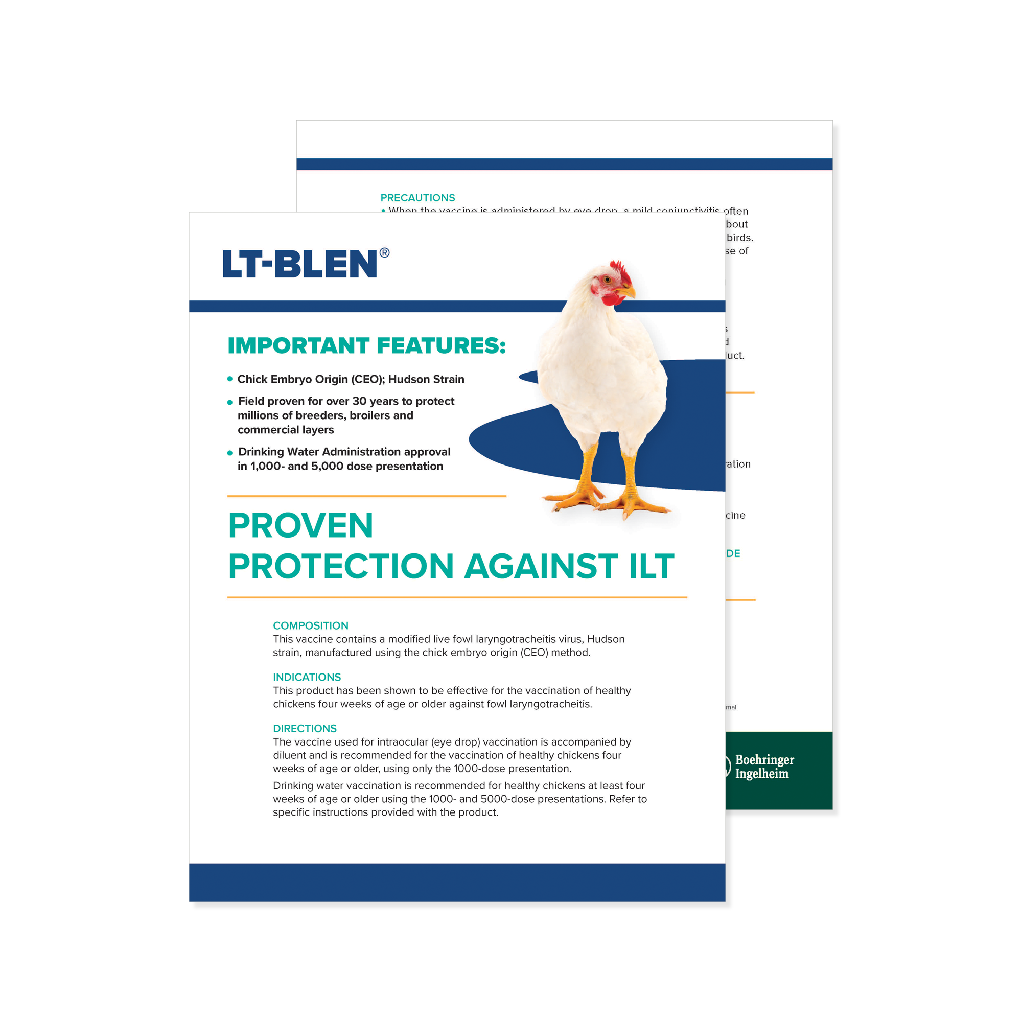
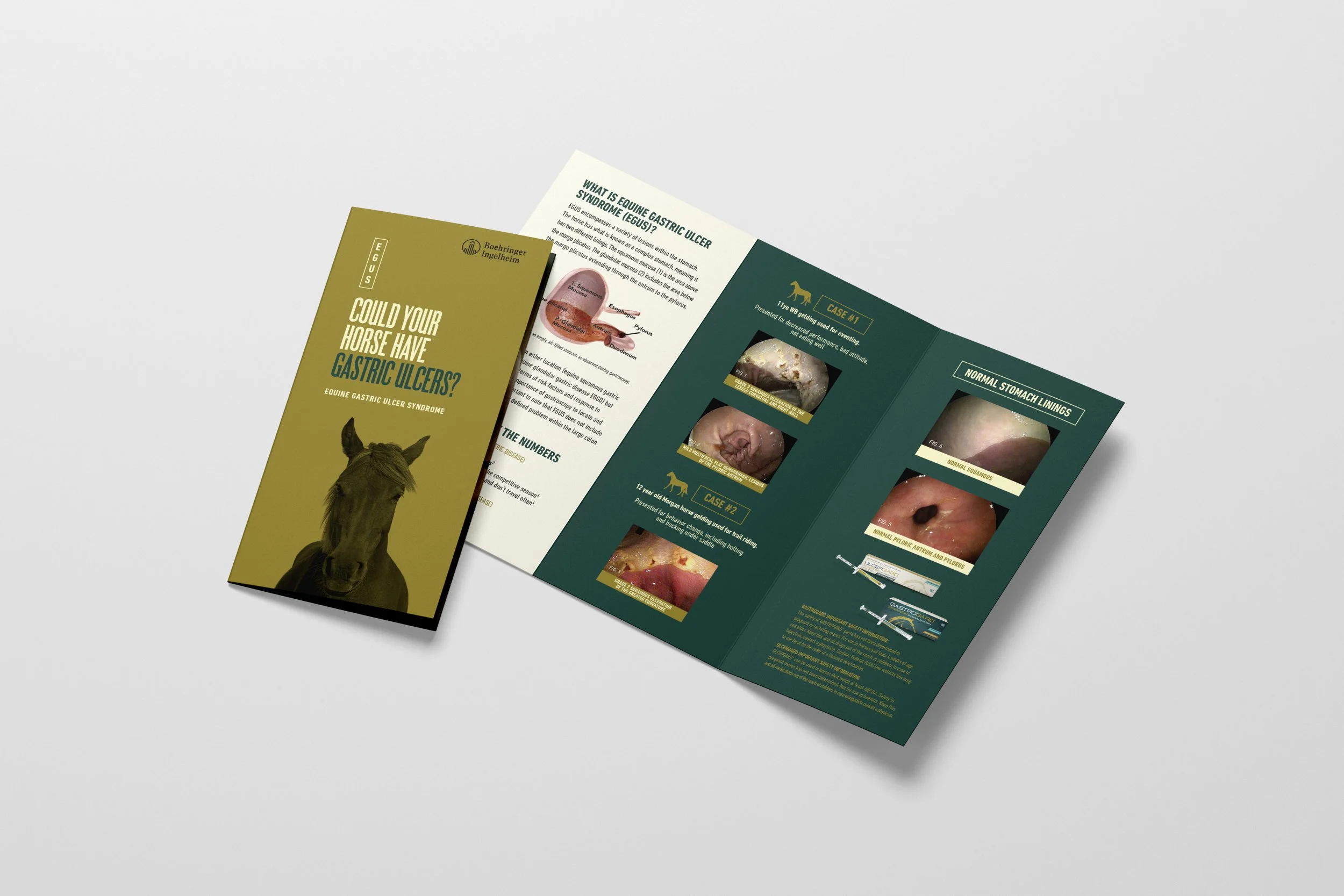
Print ads are a staple in any agency, even in the digital age, but Broadhead creates a lot of scientific tech bulletins and educational advertorials as well. The Equine Vaccine “One-sheeters” on the left, though detailed with scientific data, were branded and designed for optimal comprehension. Keeping everything consistent–and consistently proofed–after 20 versions was a job in itself. The print ads featured below display specific types of ads that show the breadth of my work and the resulting complications that each of them can bring up.

Once a print ad is designed, it is resized frequently. Every publication has specific size, bleed and live area requirements for its ad space, so I often adjust layouts to fit sometimes extreme differences.

An example of a press-ready full page plus an extra 1/3 page ad attachment, to grab the eye and allow for more information or design elements. It can require a lot of troubleshooting to fit into each publication’s print specs.

Sometimes print ads are designed to span two pages, requiring numerous layout tweaks, depending on the pub.

These Norfolk Southern ads, had to be retrofit with grayscale backgrounds in order to print with consistency.

Product detailers. Informative,
branded, and in this case the images required some retouching work.
Cl!rty
is a Shoreview, MN-based THC-Seltzer company started in 2022. I began working as a Production Artist for them in 2023.

Cl!rty
My work with Clr!ty began very early on, just after the company started in 2022. My job centered around the packaging of many different can sizes and updated designs, as well as 4-pack or 12-pack packaging—with all the different vendors we had to use as the company expanded. More volume means constant resizing as well as the continual and inevitable design updates—including the name of the product itself. Then each new design has to be refit into new templates for each new vendor. It’s very exciting to see and be a part of the
company’s growth.

Early Cl!rty sell sheets.

Name and can update in 2023.


Early 2024 new flavor editions, with new can designs.